
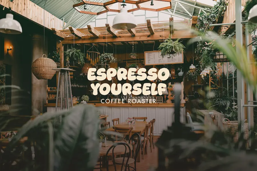
Espresso Yourself
Industry:
Creative Hospitality
What We Did:
Brand strategy, Visual identity, Content design
A place where energy flows free, ideas take shape, and every cup sparks something new.
Built from a creative frustration
The idea for Espresso Yourself was shaped by a simple observation: many talented creatives lacked a consistent place to meet, collaborate, and exchange ideas. While cafés offered a place to work, few were intentionally designed to support creative interaction and community building. Rather than creating another coffee shop, the goal became building a platform for connection.
A space where artists, designers, writers, musicians, and entrepreneurs could cross paths, discover new perspectives, and form meaningful relationships.Espresso Yourself was created to bring those people together—using coffee as the starting point, but community as the true purpose.
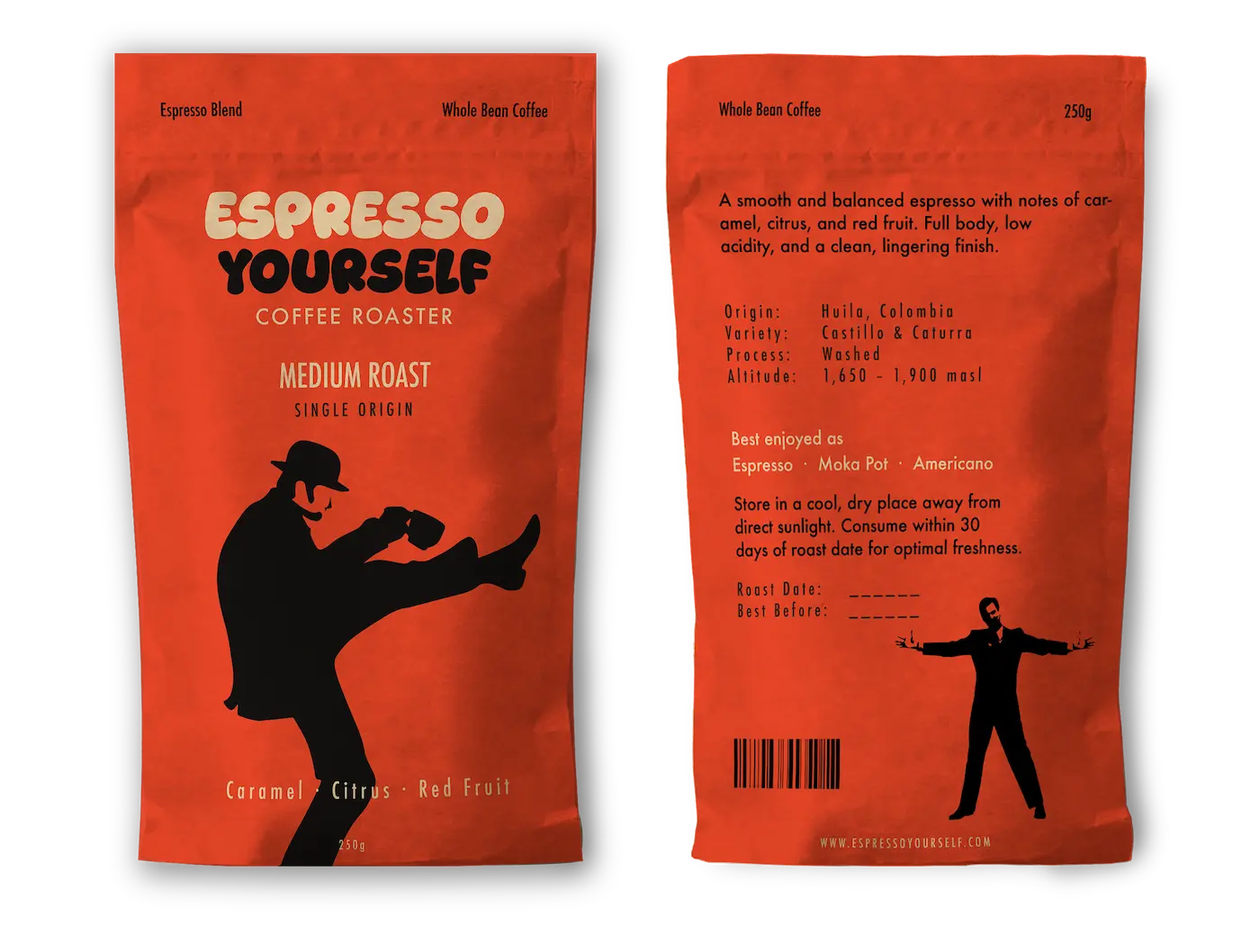
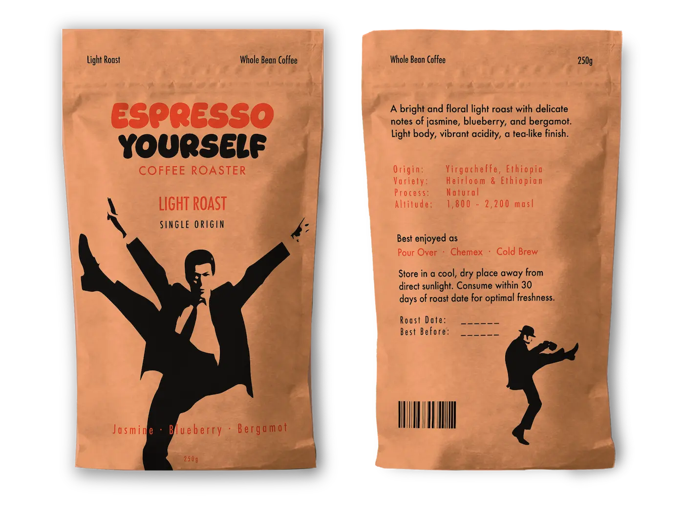
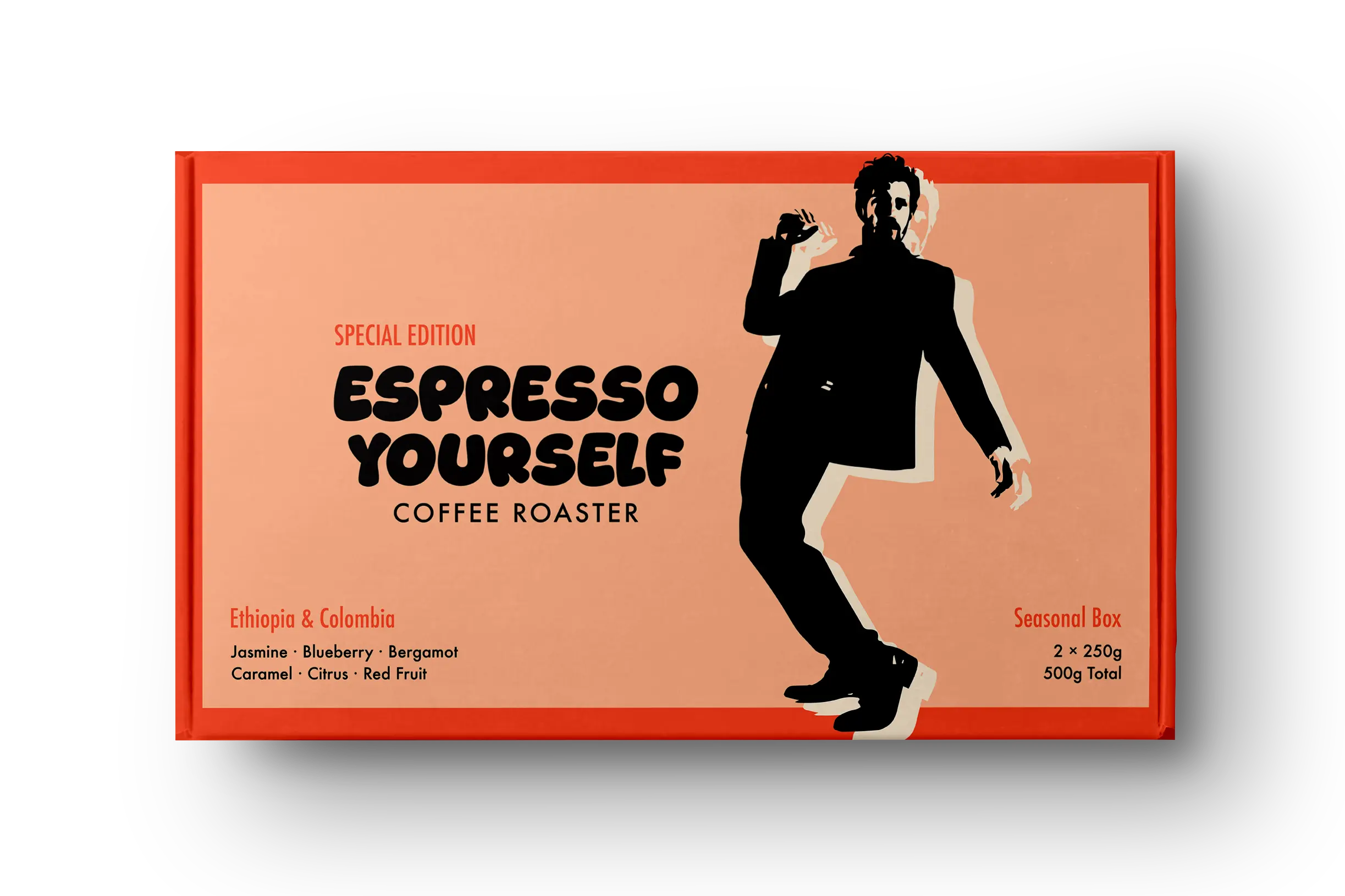
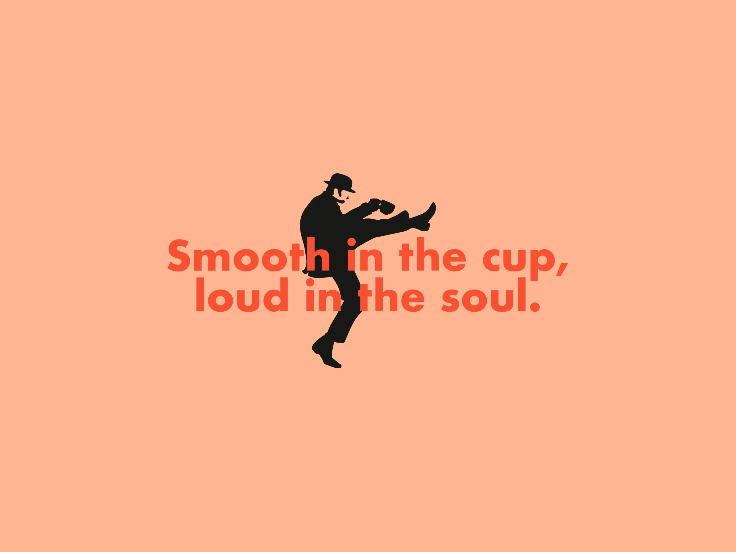
Expression in Motion
The expressive figures became a visual representation of the community itself. Artists, dreamers, thinkers, musicians, and creators are portrayed through bold silhouettes that communicate movement, individuality, and emotion.
By placing people at the center of the visual language, the brand shifts the focus away from coffee alone and toward the experiences, conversations, and creative energy that make the space unique.
#F75132
Energy · Action · Creativity · Expression
#FEB58F
Warmth · Connection · Community · Openness
Built for creativity, powered by coffee
#F7E8D0
Possibility · Simplicity · Space · Creativity
#281D1B
Coffee · Depth · Authenticity · Craftsmanship
Espresso yourself
Visual Identity Concept
The solution came from treating the name itself as an invitation. Espresso Yourself became more than a title — it became a statement about showing up fully, creating freely, and taking up space unapologetically.
Every element of the identity was designed to support that energy. A figure in motion. Typography with attitude. A color system expressive enough to live on a gallery wall, yet honest enough to work on a paper cup. Every touchpoint was built to feel participatory, like the community could leave fingerprints on the brand itself.
The space was never meant to be a backdrop. It was designed to be a stage.
The Community
The Community Espresso Yourself attracts artists, designers, writers, freelancers, entrepreneurs, and creative thinkers who are drawn to spaces with personality and purpose. They seek environments that stimulate ideas, encourage connection, and celebrate individual expression.
United by curiosity and creativity, they shape the culture of the space through conversations, collaborations, and shared experiences. Espresso Yourself becomes a meeting point where people gather not only to enjoy coffee, but to exchange ideas, find inspiration, and contribute to a vibrant creative community.
Let's talk, create
and elevate your brand!
To discuss how our team can help your brand reach it's full potential, click below.
hello@nimeostudio.com
Based in Colombia, working globally.